


Theme features
Everything Atelier can do, and how to set it up.
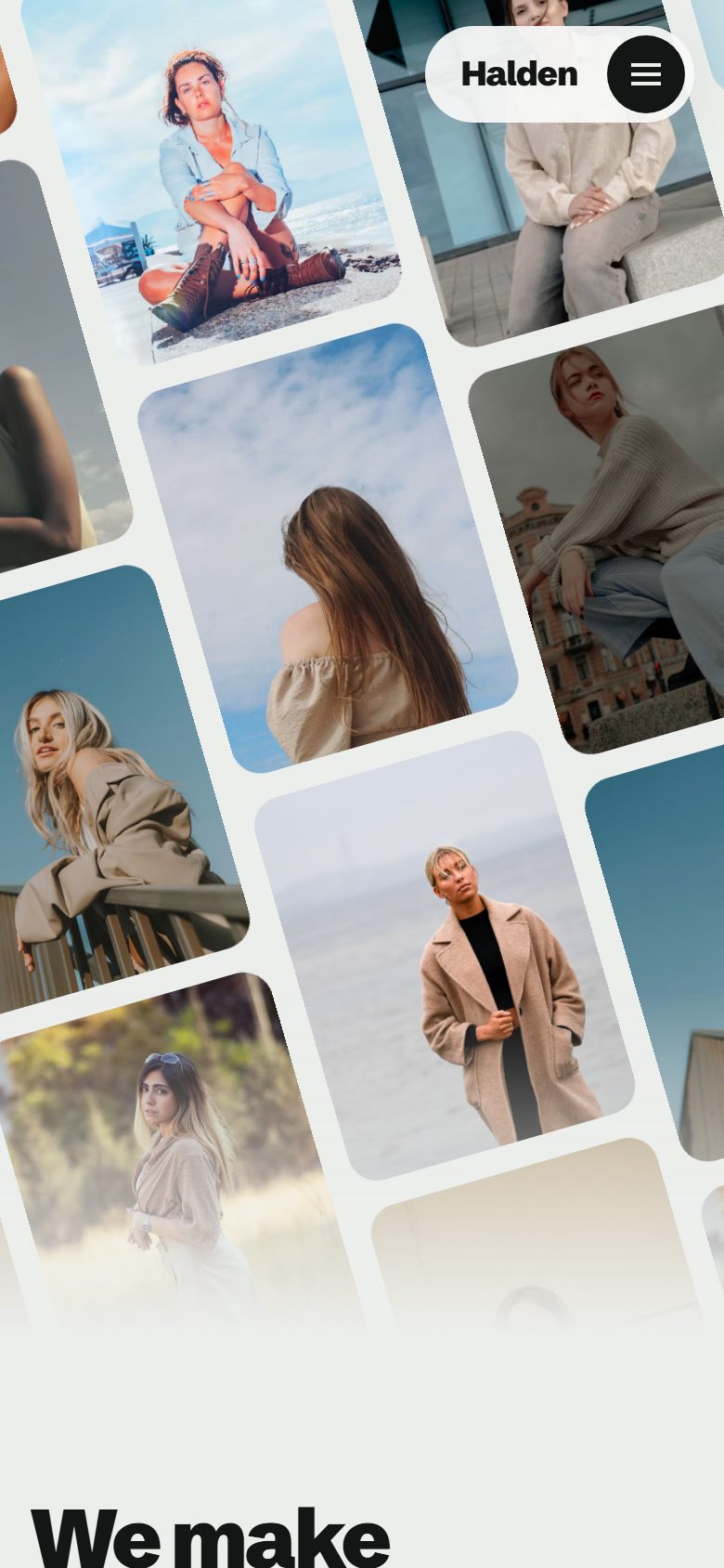
Atelier is a Ghost theme for creative studios: agencies, art directors, photographers and designers who show their work first. It opens on a tilted wall of images that drifts on its own, then lets your projects do the talking.
This page walks through what the theme does and how to set it up. Everything shown here works out of the box, without code.
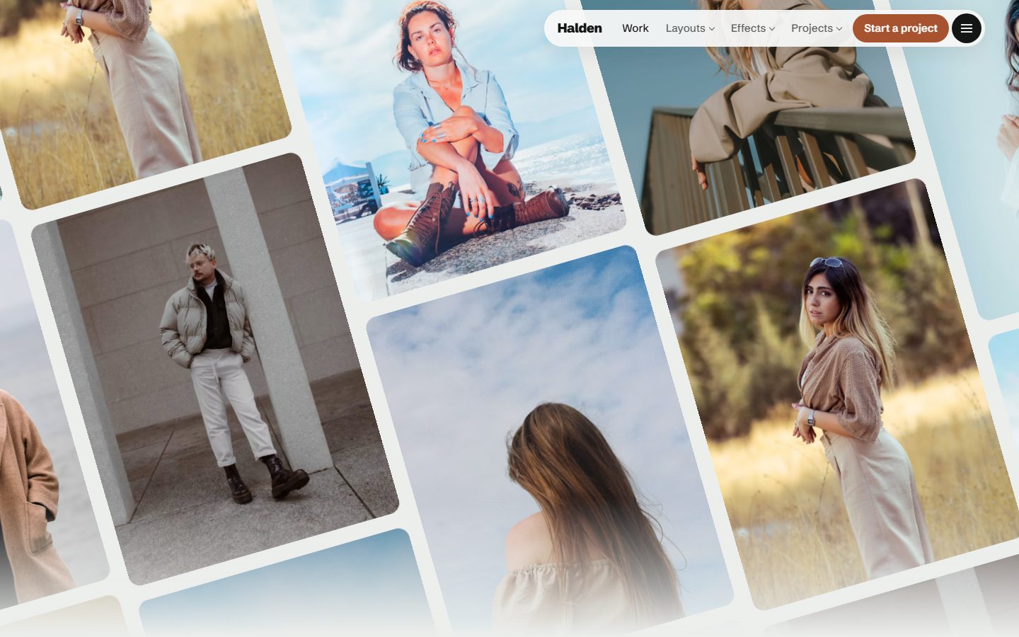
Projects that move
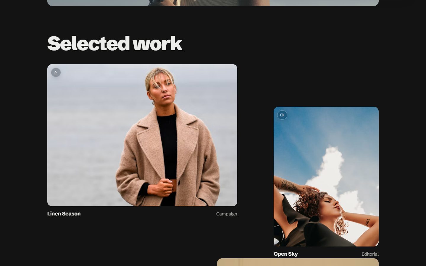
A project is a regular post with the internal tag #project. On the homepage they sit in three columns: as the reader scrolls, the outer cards lean and straighten when they reach the middle of the screen, and each picture slides gently inside its frame.
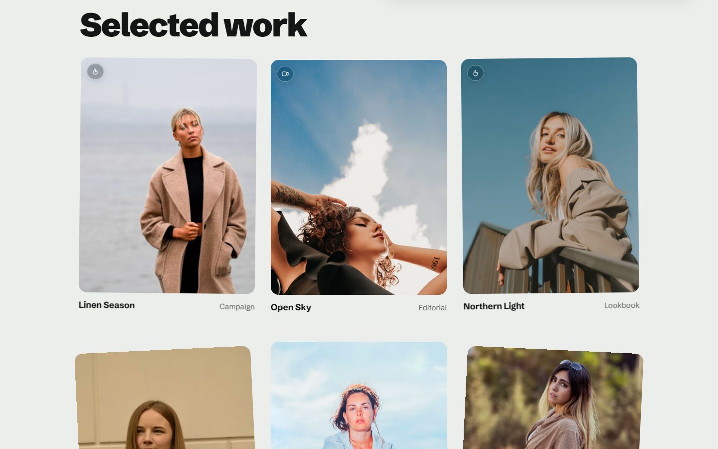
Small badges sit on the pictures: a flame for a Featured post, a camera for a project tagged #video, a lock for members-only work. On hover they open to show their name.
Four homepages
Choose the Homepage layout in the theme settings. Tilted wall is shown above.
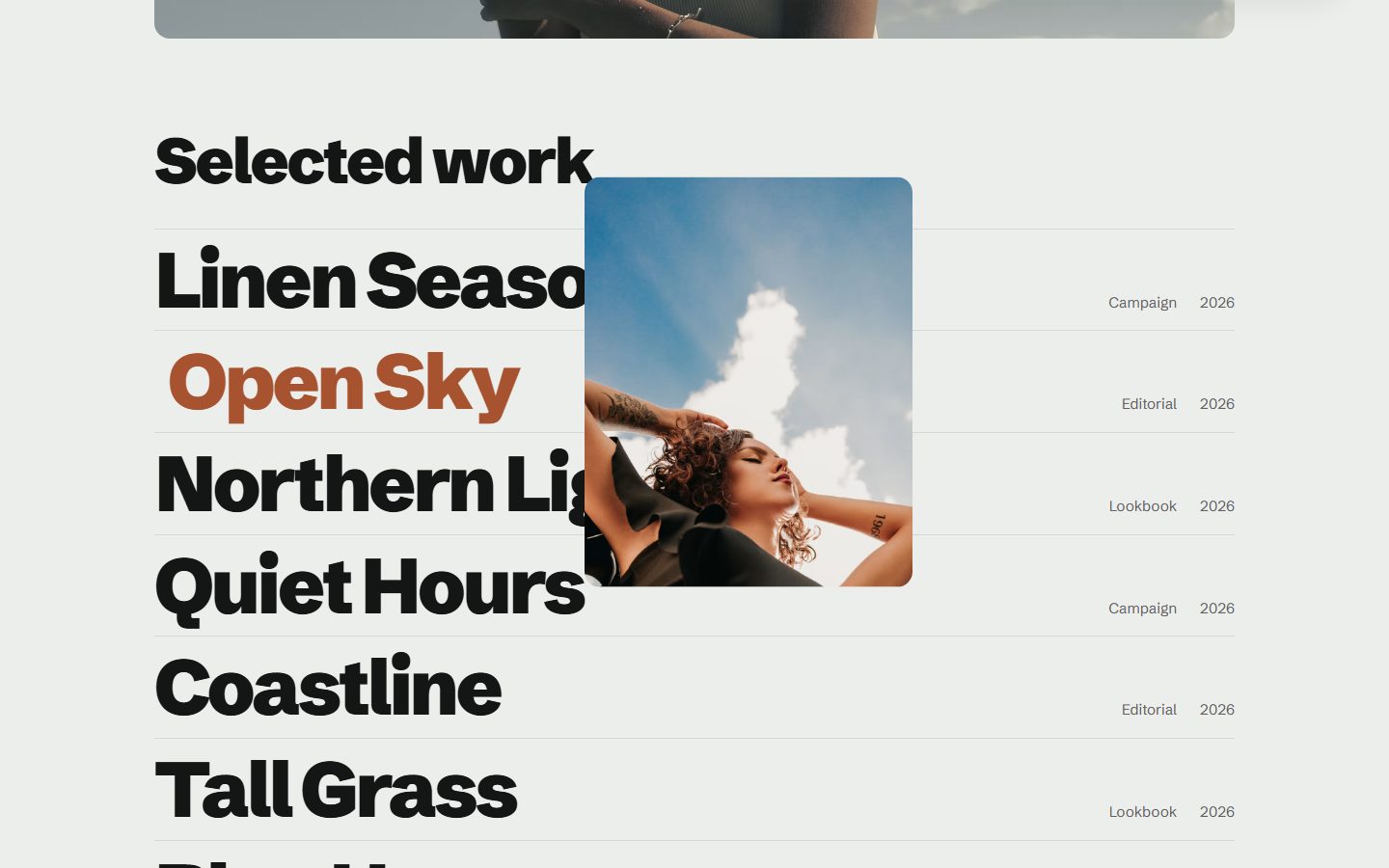
Index lists your projects as large titles. Hover one and its picture follows the pointer.
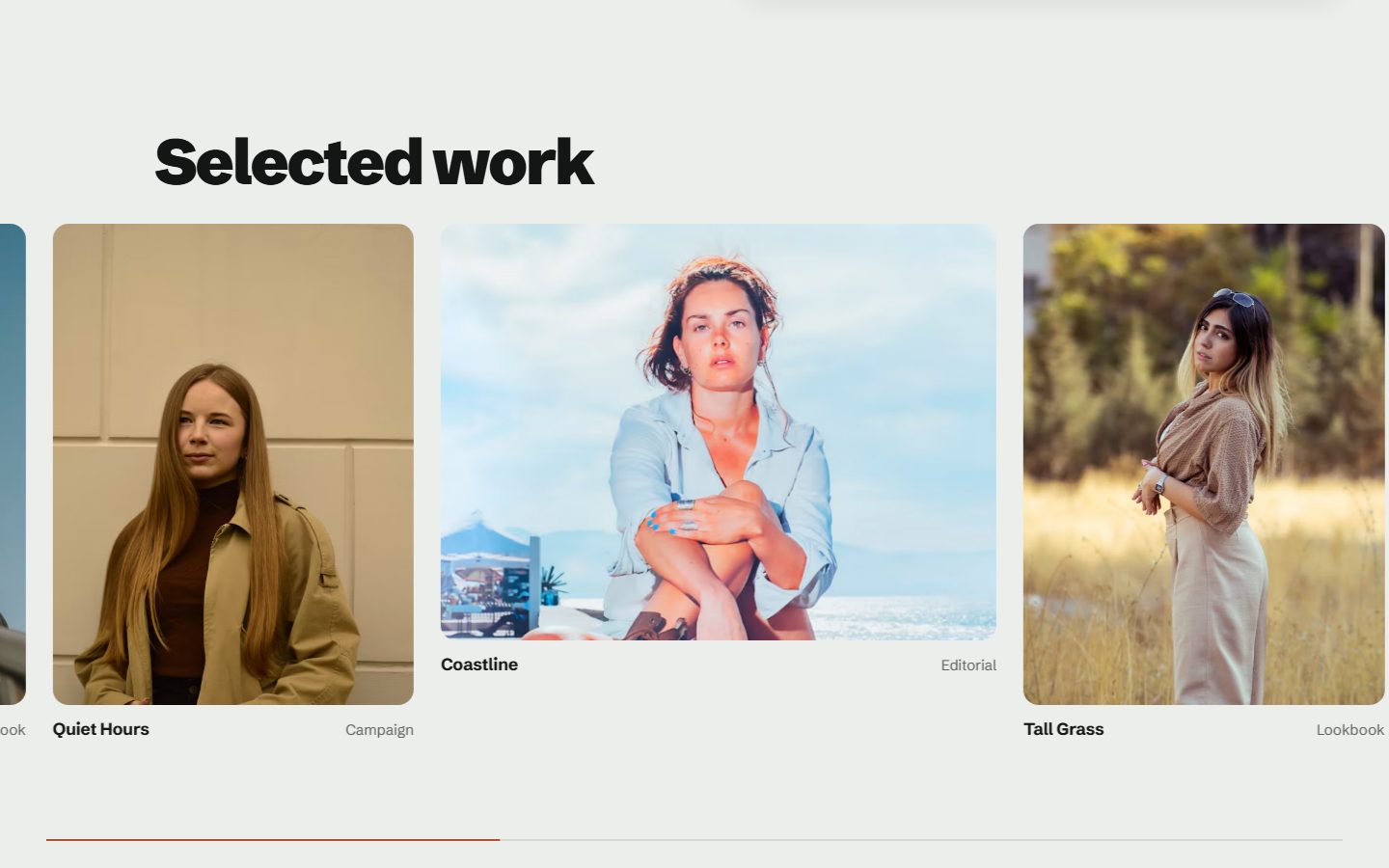
Horizontal pins the projects to the screen and slides them sideways as the reader scrolls down, with a progress line underneath. On phones it becomes a row to swipe.
Grid sets the projects on a staggered grid, large and small.
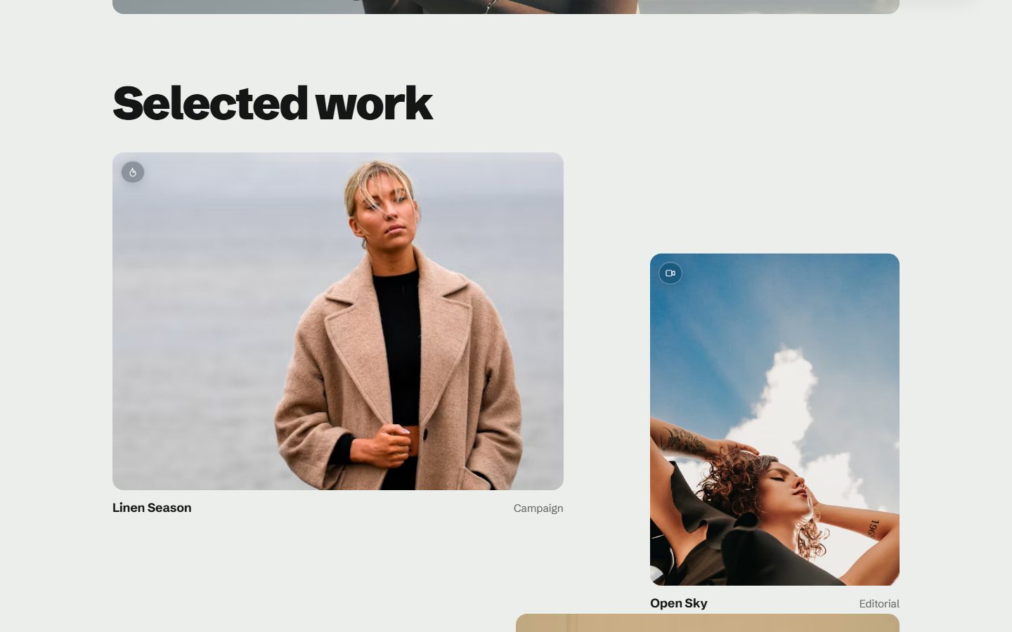
Want to show every layout, like this demo? Create a page and pick the template Home - wall, Home - index, Home - horizontal or Home - grid.
Four ways to appear
Projects and pictures appear as they enter the screen. Pick the Reveal effect: Slide, Fade, Zoom or Curtain, or None. A page can use another one with an internal tag such as #effect-zoom. Every effect stops for readers who ask their system for less motion.
Three project pages
Pick a layout in the post settings, under Template. The facts (discipline, year, team) come from your tags, the publication date and the authors: nothing extra to fill in.
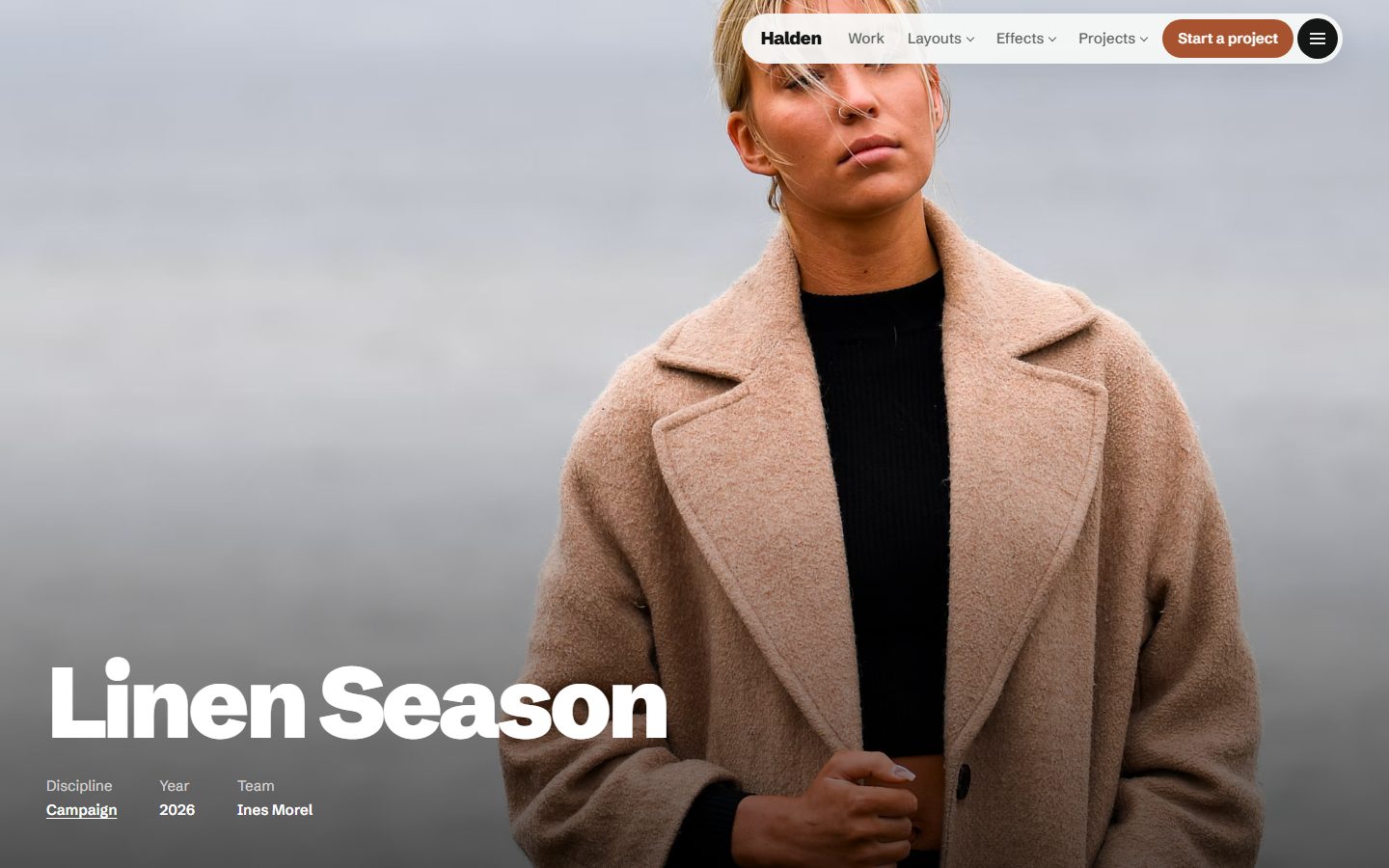
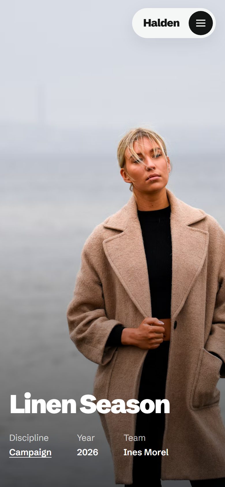
Cover, the default: the feature image fills the screen, the title and facts sit on it.
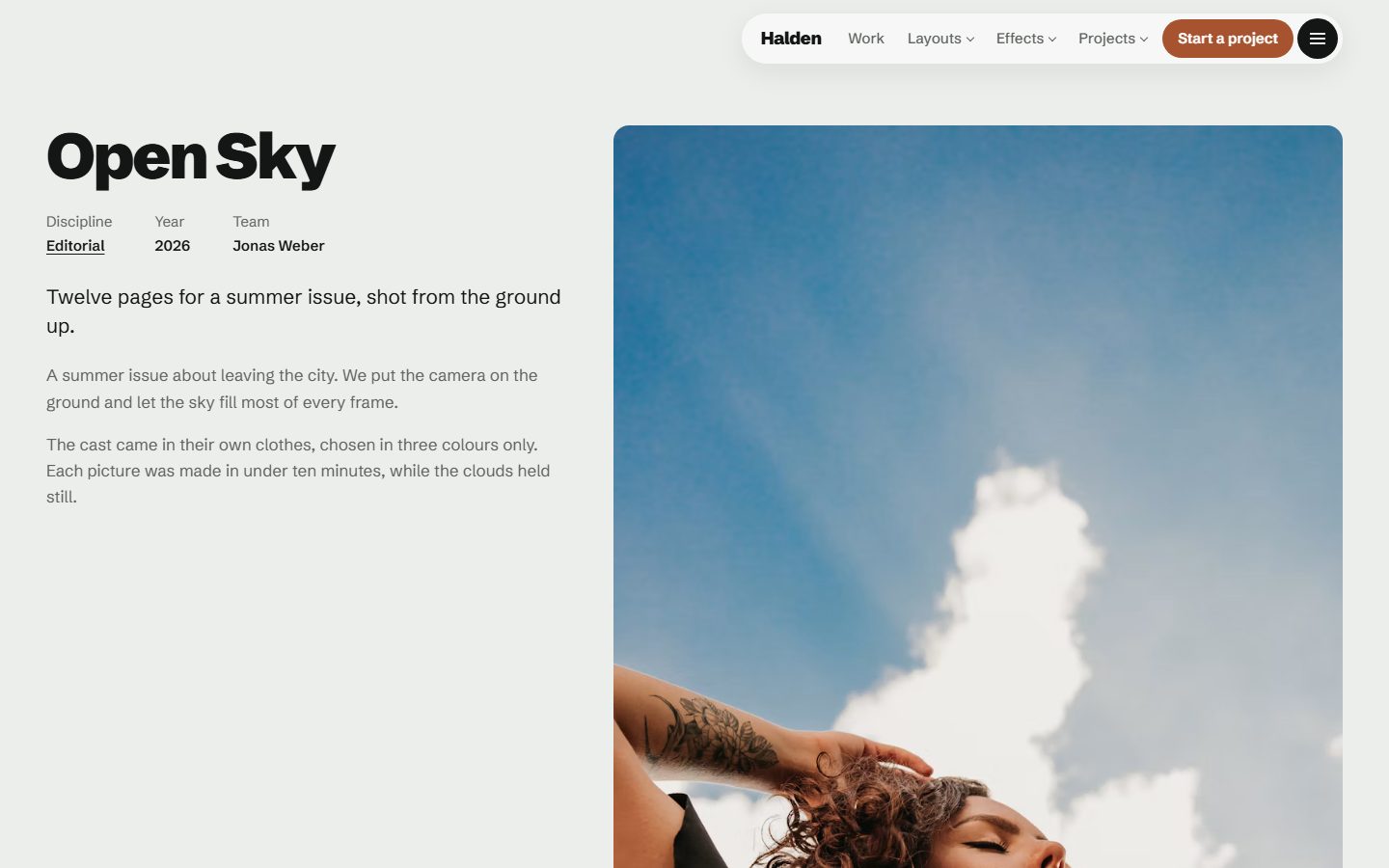
Project - side: the text stays on the left while the images scroll on the right.
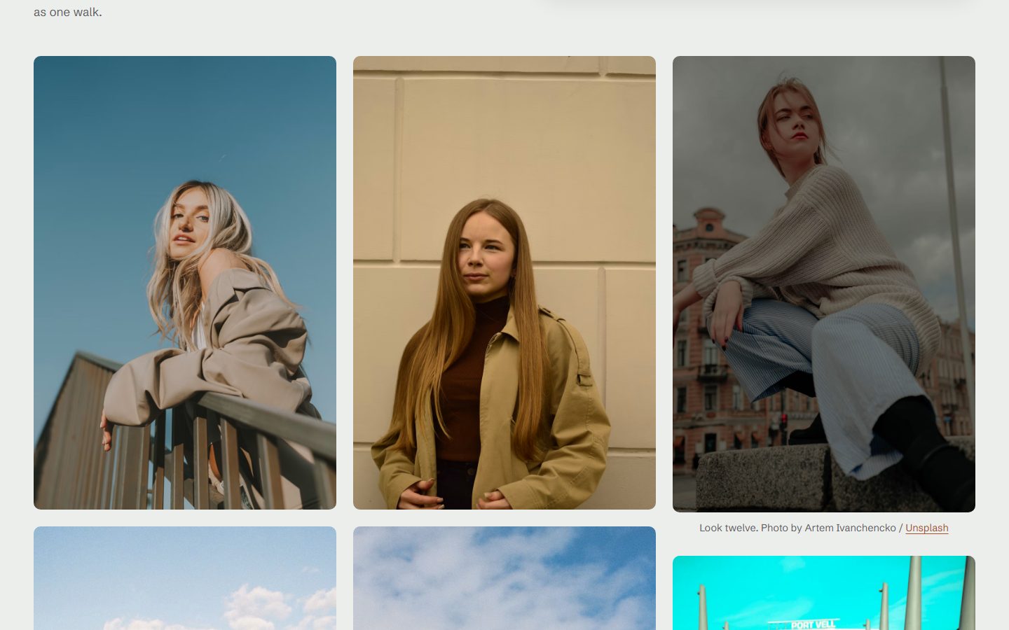
Project - gallery: the title and text, then every image of the post in columns.
A menu that takes the whole screen
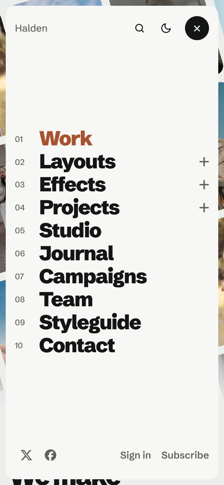
The bar keeps your main links, with dropdowns: start a label with a dash, like -Index, in Settings, Navigation, and it joins the link above it. The menu button opens a full-screen panel with your secondary navigation set very large and numbered, and a picture beside it that changes as you hover. On phones, the panel shows both navigations.
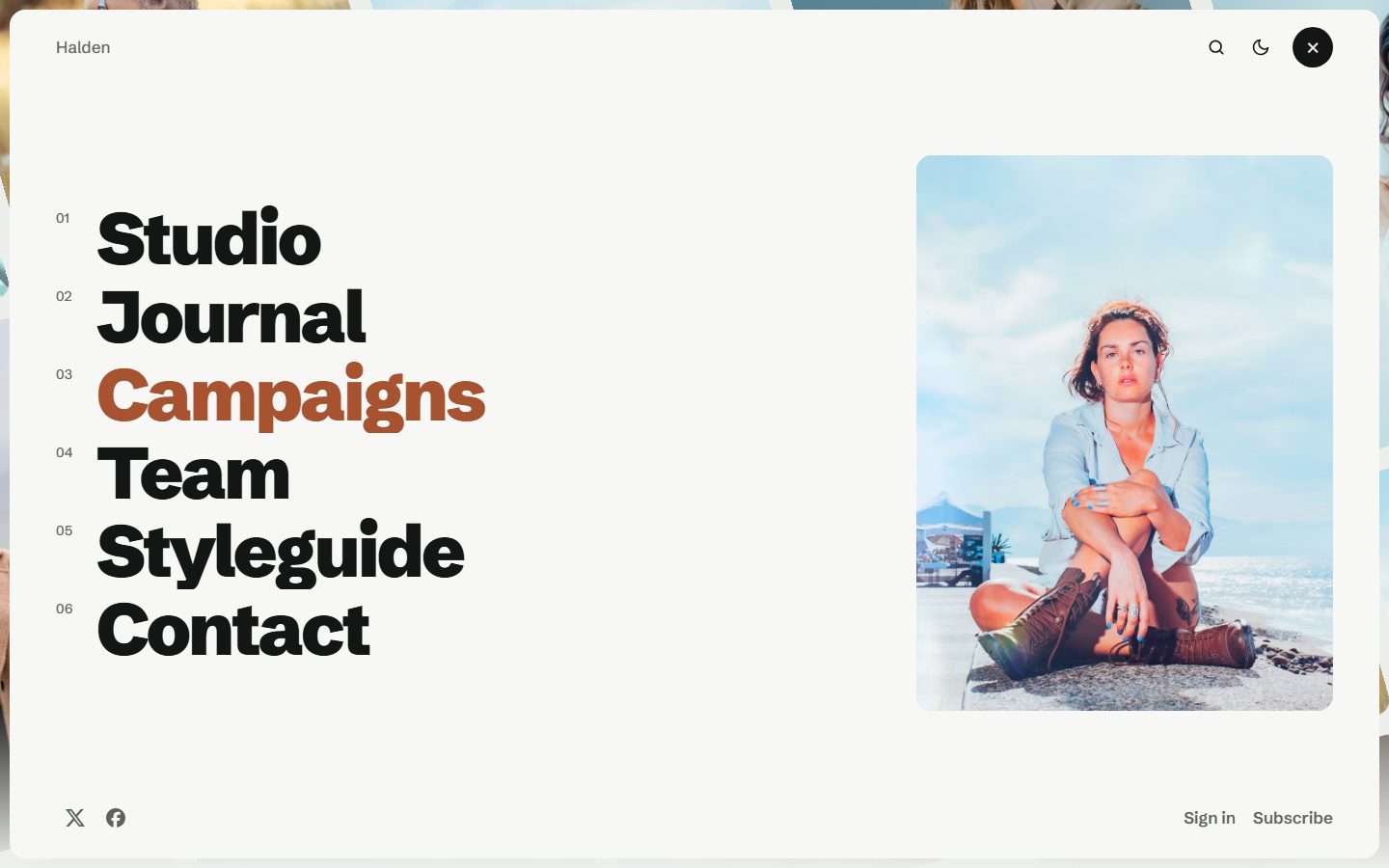
Journal and studio
Posts without #project form your Journal, with a table of contents for long reads and a reading progress line. The Studio section of the homepage shows the page with the slug about.
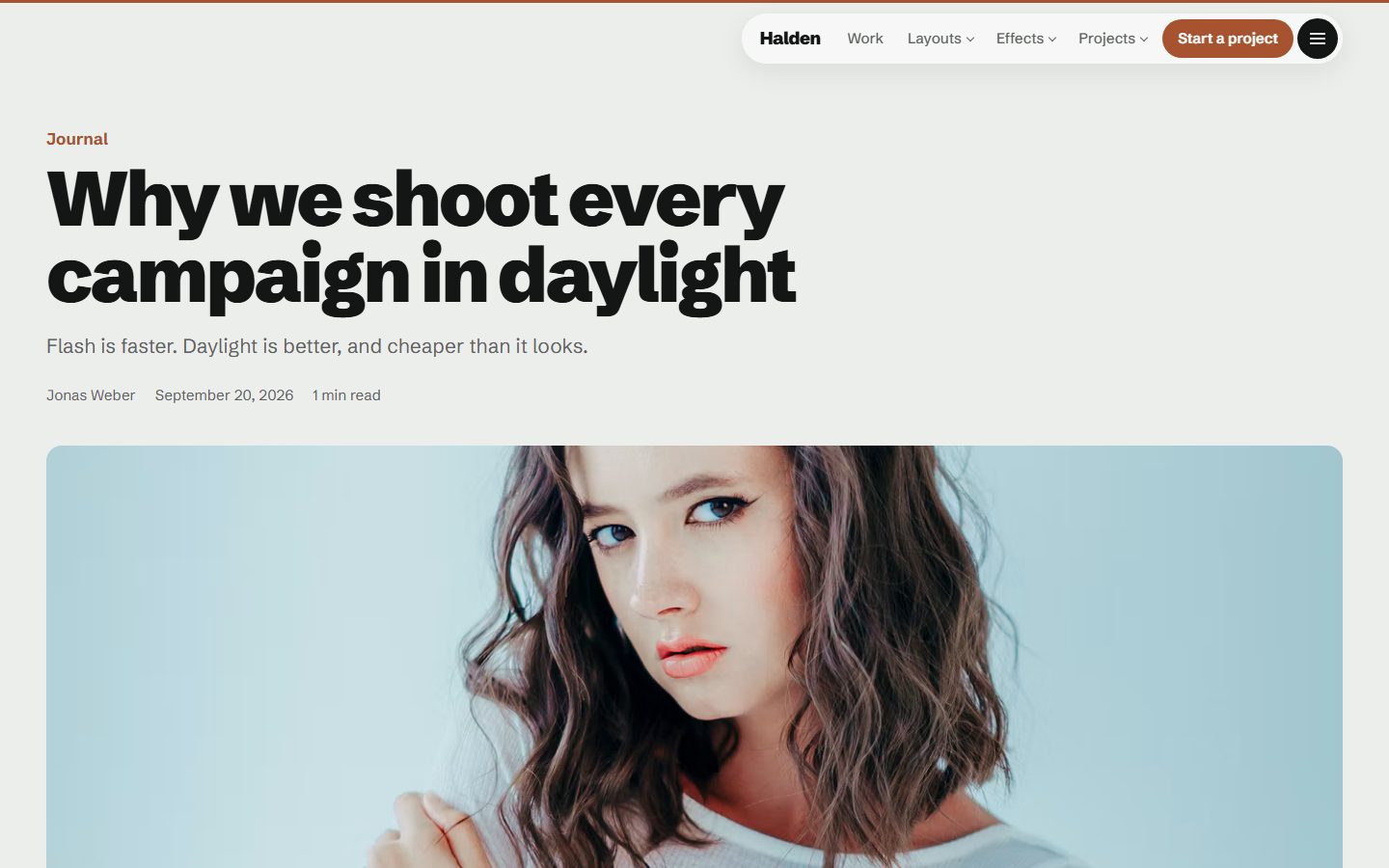
Light or dark
Choose the default colour scheme: Light, Dark or Auto. Readers can switch from the menu. The accent colour from Settings, Design & branding is used for buttons, highlights and the heading's highlighted words.
On every screen
Theme settings
- Homepage layout: Tilted wall, Index, Horizontal or Grid.
- Reveal effect: Slide, Fade, Zoom, Curtain or None.
- Heading (words between
*asterisks*take the accent colour), text, button and its link. - Homepage sections: wide image (the Publication cover), projects, studio and journal, each on or off.
- Color scheme: Light, Dark or Auto, plus an optional logo for dark mode.
- Footer heading, footer text, Other social links and an optional newsletter block.
- Table of contents on or off for long posts.
Everything Ghost offers
- Members, free and paid subscriptions, with members-only posts.
- Native search, opened from the menu or with
Ctrl/Cmd + K. - Ghost comments.
- All editor cards. See them on the Styleguide page.
- Responsive images, lazy loaded, and fully translatable text.